Reviewing the FiveThirtyEight House Forecast 2018
Understanding the how the models faired in predicting voteshare in the 2018 mid-terms
[This is a static version of a live Observable Notebook where the map is interactive]
FiveThirtyEight produced various models for predicting the results of the US midterms. One of these models predicted results for the House of Congress. It produced predictions for the share of the vote won by each candidate. In a podcast, Nate Silver asked listeners to judge the model by checking the results district-by-district and seeing if the outcome at the election was within the range of predictions.
I decide to look at how often the winning candidate’s actual vote share fell within the range predicted by the model and to visualise this as in interactive cartogram.
In the chart above each hexagon represents a congressional district. The districts are shaded to show how the model performed. They are green when the candidate’s share of the vote falls within at least one the model’s prediction ranges and yellow if not.
If you hover over a district a pop-up will show more information about the results. For each candidate the bright green line shows the candidates actual share of the vote while the 3 bars behind the line indcate the range of the predictions of that candidates voteshare for each of the 3 models.
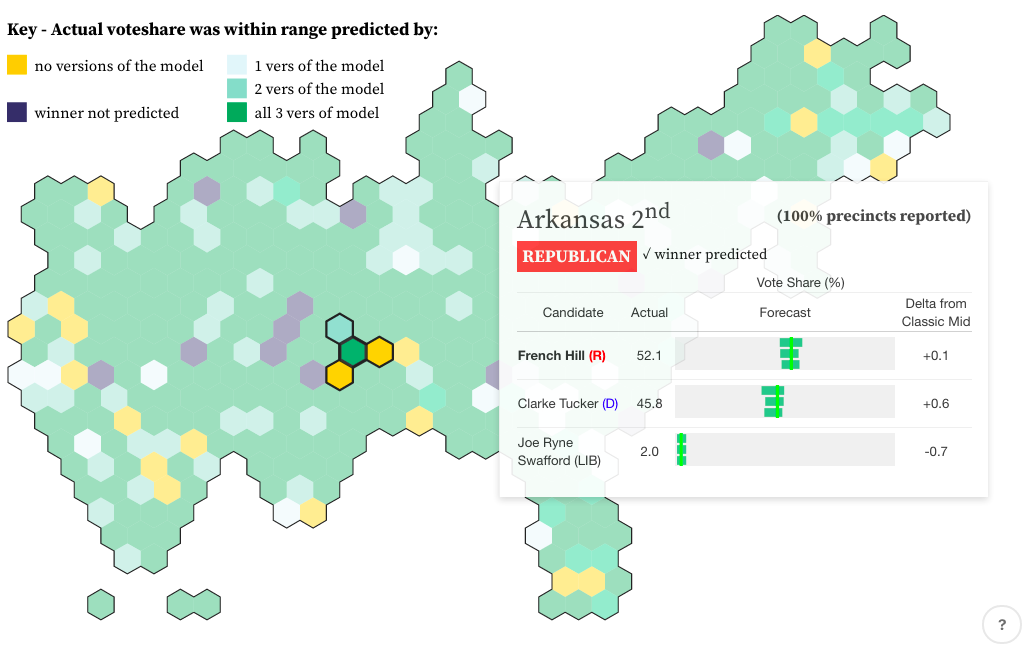
Only in a few districts are there any surprises - where the winning candidates actal voteshare was not within the range predicted by any versions of the model.
Overall it appears that voteshares were mostly in line with the model predictions. One exception is the clustering of vote share ‘misses’ on the West Coast. Vote shares in California don’t seem to match the ranges predicted by the model.
Was there any bias to these prediction misses that might provide something interesting to dig into about how the candidates races went or what assumptions were made in the model?