Open Data: Katine Style!
Whenever things seem to be getting too complicated I tried to think back to this example of open data from the Katine project in Uganda.
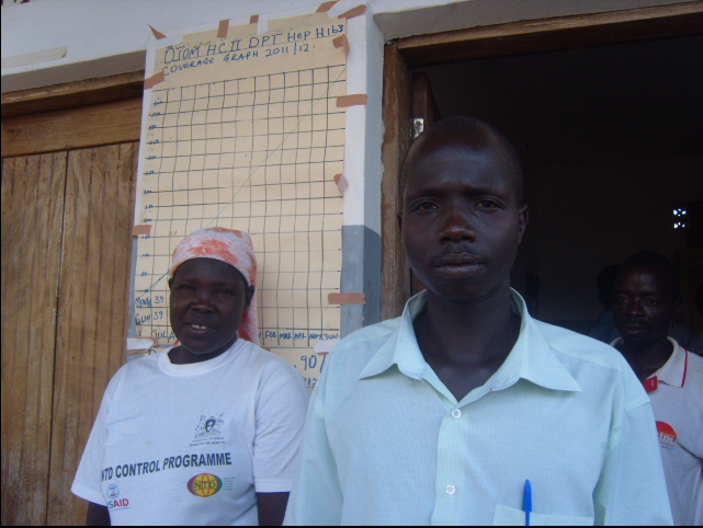
The Ojum health centre is in the Katine district of northern Uganda. For the last 4 years Katine has been the focus of a development project undertaken by the Guardian, Barclays Bank and AMREF. One of the aims of the project was to open up the process of ‘doing development’ to the Guardian’s audience.
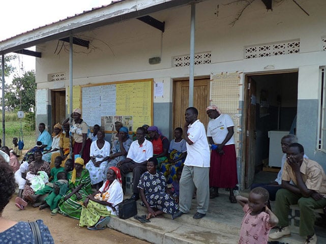
In 2011 I was fortunate enough to be able to travel with colleagues from the Guardian to visit Katine and see for myself the work that was being done in partnership with the local community.
One day we visited a local health clinic and the handwritten A3 poster on the outside of the clinic caught my eye.
Behind the lady in the red skirt was a plot showing the progress of a vaccination programme being run from the clinic. The horizontal axis shows months of the year and on the vertical the cumulative number of vaccinations that have been carried out to date. The straight diagonal line plots the target for vaccinations and is based on central government estimates of population and demographics for the area.
Whenever I’m stuck in the weeds of extracting, cleaning and visualising data I try to think back to this example and ask myself a version of Occam’s Razor: Are you solving this problem in the simplest way possible to meet most of the needs of the users? In this case the poster is a pretty good minimum viable product. The ‘open data’ displayed here provides accountability for the vaccination programme to any member of the community who can travel to the clinic.