Tutorial: Mapping cycling times to BSN Vlaskamp
My experiment in using Google Distance Matrix API and Observable Notebooks to map out cycling times to BSN campus Vlaskamp.
This is a static copy of an Observable notebook.
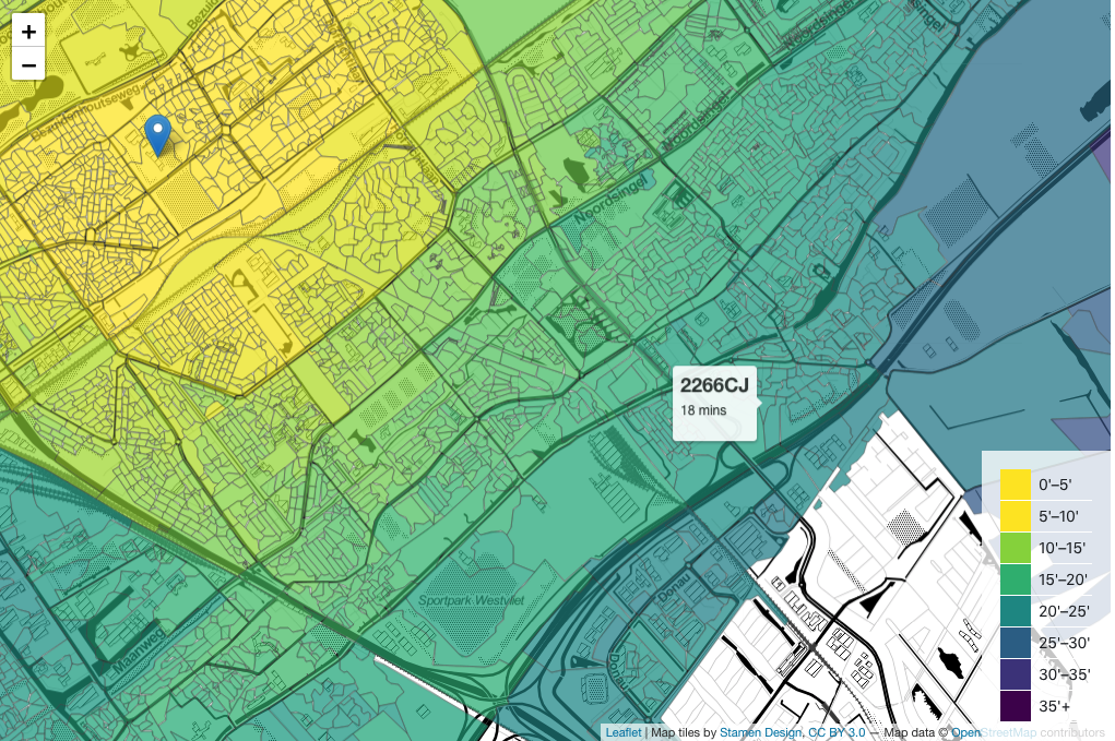 Figure 1: A heatmap overlaid on a leafletjs map to explore cycling times to BSN Vlaskamp campus. The heatmap is constructed by drawing a polygon for each postcode boundary and shading that area according to journey durations obtained from Google Distance Matrix API.
Having commuted by cycle in a number of cities I have found that actual travel times can vary significantly from a naive estimate based on ‘as-the-crow-flies’ distances. Dreams of quick rides can be scuppered by having to find a route around a railway or major road. Moving to a new city seems like a good opportunity to test this hunch.
This lead me to use a journey time estimator - in this case the Google Distance Matrix service - to calculate journey times and distances. Maybe this was overkill, but it was an interesting project.
I also opted to use an Observable notebook to bring it all together.
Making the Chart
These are the basic steps to create the map and overlay:
- Display the basemap using
leaflet.jswith tiles from OpenStreetMap - Create a ‘heatmap’ by drawing a polygon marking the boundaries of each postcode.
- Colour the polygons to indicate typical journey time from a house in that postcode using results extracted from the Google Distance Matrix API
Why leaflet?
In part the chart is a tool for finding somewhere to live so it’s important to me to be able to see the streets and other features of the city as reference points. I experimented with OpenCycleMap tiles that show cycle routes but they proved to be very busy visually. For a while I adopted the default OpenStreetMap layers but the colours distorted the colour of the transparent heatmap overlay. For example, in areas of green parkland or blue water. In the current version I have adopted the monochrome Stamen Toner base layer.
Why draw polygons using postcode boundaries?
At first I thought of laying out a grid of Lat-Lon points that covered the Den Haag area and then calculate the journey time from each point to the school, interpolating the results to provide a Heatmap overlay in the notebook that was the inspiration for this one. This may still be a more efficient approach.
But I have to admit I’m a sucker for geographical postcode data and I found that shape files for the boundaries of all Dutch postcodes are available. It struck me that it would be relatively straight-forward to construct a kind of heatmap by drawing a polygon for each postcode and shading them to indicate journey time. This would also have the advantage of more explicitly aligning the colours to physical boundaries on the map, i.e. streets.
The postcode boundaries are available in this massive file most of which I don’t need. I pruned and converted to GeoJSON using lists of Dutch postcode areas and python scripts.
But there were still thousands of postcodes. As I had in mind to use the Distance Matrix API this was a problem as it is not a free service (although I am making use of a trial period). So I built a tool to allow me to extract the postcodes I needed visually with a simple point and click.
Using the Google Distance Matrix API.
The Distance Matrix API requires two points as input: start and destination positions. Our destination is always the school, but I needed a point representing each postcode. The centroid of each postcode polygon would probably have been good enough, but I noticed that in addition to boundary data, the postcode shapefiles contained the locations of the buildings within each postcode. An average of these locations seemed quite a good way to give a ‘centre of gravity’ for that postcode which could act as the starting point of our Journey.
This manipulation, and querying of the Distance Matrix API was done using separate python scripts.
How is the heatmap coloured?
I realized that I was primarily interested in only a subset of all the journey times, and that I wanted my heatmap to convey differences within this range. Therefore I limited the domain of the colour scale to between 5 and 35 minutes. Anything over 35 minutes I regard as too long and under 5 minutes, well, what the point of using the bike.
Reflections
Because of the difficulty in perceiving small differences in a continuous colour scheme this visualisation has perhaps ended up being pretty rather than useful. A next iteration might look at merging the polygons with similar travel times to form a contour map aligned with the natural boundaries of the city that are largely captured in the postcode data.